

The nation’s discontent and malaise have been a central feature of my series of columns on the concept of “Broken New Zealand”. The series argues that we are witnessing a decline driven by an oversized corporate power that has produced broken, uncompetitive markets and poor government decision-making.
The very first post in the series was about opinion polling that showed the sense of despair, especially with the public increasingly saying that they feel New Zealand is headed in the wrong direction – see: New Zealand is off the rails. Of course, the measurement of this malaise is based on opinion polling, so it is a very subjective metric. But, is there more objective and scientific evidence of malaise and unhappiness?
The Hooton Misery Index
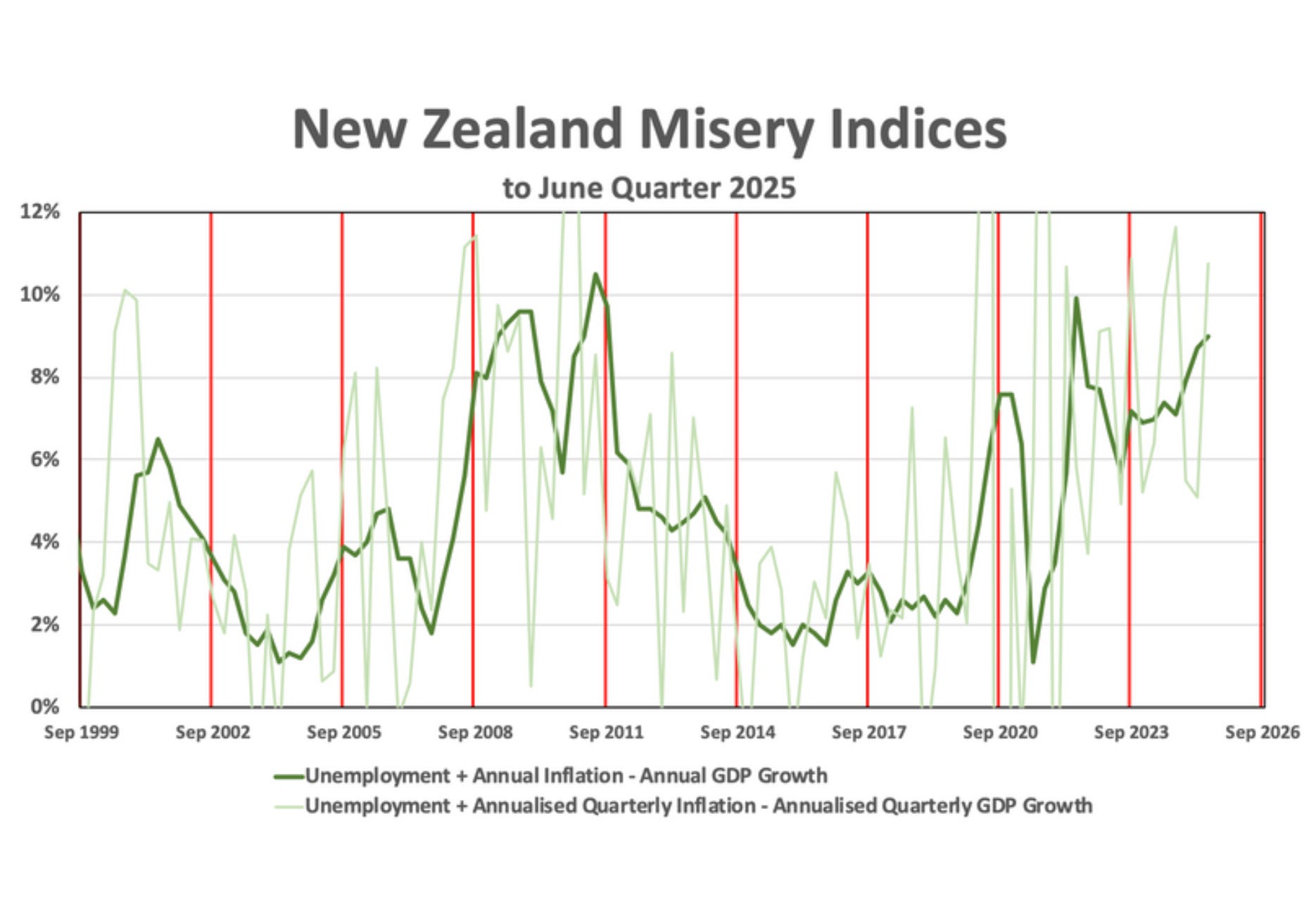
It’s good timing, therefore, that today Dr Matthew Hooton has launched his “Hooton Misery Index” to attempt exactly this. The Misery Index is a chart that Hooton will continuously update, which indicates the levels of economic pain being felt in the electorate. You can see his first version above.
Writing on his (paywalled) Patreon email newsletter account, Hooton explains that he’s reviving the 1970s concept of a “Misery Index” because New Zealand’s political economy now seems akin to that pre-Rogernomics era in which the country was in decline but there was not yet any sense of how to fix it.
Here’s his explanation: “The economic and political position feels a bit like the 1970s – stagflation (although not as bad as back then), worries about energy security, the need to find new export markets, structural fiscal deficits, grumpy voters, politicians not having any idea what to do, and a general sense that the end of an era is nigh but without any idea of what should or will replace it”.
New Zealand does indeed feel very late-1970s or early-1980s at the moment, as if the old models of running the economy and society have broken down, and we’re waiting for a new version of the Fourth Labour Government to shake things up.
Hooton explains in his latest email newsletter the methodology for calculating his Misery Index: “The old 1970s Misery Index was just the sum of inflation and unemployment. The idea was that you look at how it was at the beginning of a US president’s term and when they go for re-election, if it’s gone up, they’re in trouble… It seemed to me that the best measure would be [Unemployment + Annualised Quarterly Inflation – Annualised Quarterly GDP Growth]. For the June quarter, this Misery Index (Quarterly Data) stands at 10.8%.”
Hooton labels this quarterly measure the “volatility” component of the Hooton Misery Index. But he’s also calculated a “stability” component based on annual data: “I also looked at [Unemployment + Annual Inflation - Annual GDP Growth] which is more stable. For the June quarter, this Misery Index (Annual Data) stands at 9.0%.”
Hooton’s two misery calculations are visible in his graph at the top of this column. The dark green line is the “stability” annual version, and the light green line is the “volatility” quarterly version. And the vertical “red lines indicate September quarters in election years”.
Looking back at his Misery Index for the last 25 years and what it means for politicians, Hooton says: “life tends to get politically tricky for incumbents whenever the annual misery index goes above about 6. For the current Government, the trend line is up and the absolute number is above 8 – but if it can turn that around, and get it trending down towards 6 then it would put the governing parties on good ground for re-election.”
NZ’s place in the Global Annual Misery Index
It’s worth noting that Hooton is not the only one calculating national misery. Johns Hopkins economist Steve Hanke compiles a Global Annual Misery Index, which in 2022 showed New Zealand tumbling down the happiness rankings. His formula is a bit more complex – unemployment (weighted double) + inflation + lending rate – GDP per capita growth.
Hanke’s conclusion for New Zealand has been similar: the country has become markedly more miserable. In 2021, we ranked near the world’s happiest (5th from the bottom in misery, out of 156 countries). By 2022, we had leaped to the 104th most miserable spot. That was one of the biggest deteriorations worldwide. Hanke singled out our high inflation and borrowing costs as key culprits, alongside sluggish growth.
Then in 2023, there was another huge shift for New Zealand, leaping in the misery to the number 82. The score for 2024, released in February this year, put New Zealand at a slightly improved position of 88 out of 162. So, overall, Hanke’s index shows that New Zealand has increased in misery from being at the 151st most miserable country to the 88th most miserable place. That’s a worrying shift in three years.
Tracking Prosperity – and who’s behind it
Economic misery is only part of the picture. What about the other aspects of life, such as health, education, safety, housing, the environment? Even if inflation subsides, are we better off as a society?
To grapple with that, New Zealand has turned to broader wellbeing indices. The Treasury famously developed a Living Standards Framework with dozens of indicators, and the Labour Government trumpeted “Wellbeing Budgets” (though critics called them sloganeering). But perhaps the most ambitious new tool comes from academia: “New Zealand Prosperity Live”.
Launched in late 2025 by Massey University, Prosperity Live is billed as a real-time national wellbeing tracker. It’s like a dashboard measuring the nation’s vital signs beyond GDP. It continuously compiles data (using AI algorithms) on eight dimensions of individual wellbeing – education, health, income, housing, employment, safety, social wellbeing, and work-life balance – as well as five measures of business health (from financial strength to sustainability).
The goal, says lead researcher Professor Christoph Schumacher, is to “redefine how we measure success” in New Zealand beyond just economic growth. Instead of waiting months for official stats, this platform aims to give an up-to-date daily snapshot of how Kiwis are really faring across the board.
It’s a bold innovation, and free to the public too. At first glance, Prosperity Live seems like an antidote to one-dimensional indicators like the Misery Index. After all, a low unemployment rate might mask misery if those jobs are drudgery; GDP growth means little if its gains flow to only a few. Prosperity Live can show, for example, if health outcomes are improving, if education scores are rising or falling, if people feel safe, and if work-life balance is decent – all alongside the raw economics. In theory, it provides a more holistic report card on the nation’s wellbeing.
However, before we hail this as a breakthrough, we should scrutinise who’s behind Prosperity Live and how it’s framed. Notably, the platform has strong business sector ties. The launch event was hosted by Foodstuffs North Island’s CEO, Chris Quin, who enthusiastically endorsed the tool. And Prosperity Live’s creator, Prof Schumacher, is not just an academic; he’s also an adjunct fellow at the New Zealand Initiative, the pro-business think tank.
The NZ Initiative (whose members include major corporates) has been involved in Schumacher’s previous projects like GDP Live and even an earlier “Shared Prosperity Index”. And now the NZ Initiative helps fund the Massey University tool. All this suggests the Prosperity project isn’t happening in a vacuum – it has influential corporate and political backers.
Why does that matter? Because metrics are not neutral. What we choose to measure – and how we weight it – reflects values and priorities. A platform developed in partnership with business may lean toward certain interpretations of “prosperity.”
For example, the inclusion of a “business prosperity” index (with innovation and financial resilience metrics) alongside social metrics is telling. It implies that business outcomes are an inherent part of national wellbeing. That’s certainly arguable. Certainly, a thriving business sector creates jobs and wealth. But it also raises questions. Who decides what counts as prosperity? If crime stats worsen or child poverty rises, but corporate profits and innovation tick upward, will the tool paint a rosy picture or a grim one? How are these diverse indicators aggregated or presented? The risk is that subtle biases (like prioritising economic growth or framing problems as needing business-friendly solutions) could creep in, given the sponsors.
Despite these concerns, Prosperity Live is a valuable addition. It shines light on areas often overshadowed by quarterly GDP headlines. For instance, early glimpses from the platform (and related research) have highlighted worrying trends: educational achievement slipping, healthcare wait times growing, housing affordability hitting lows, and personal safety concerns rising (with crime fears up). Unlike a single “misery” number, the Prosperity index can pinpoint which aspects of wellbeing are declining. And unlike government static wellbeing reports, it updates dynamically. That puts pressure on policymakers: if the index reveals, say, housing or mental health deteriorating in real time, there’s nowhere to hide. In theory, it’s a tool for greater accountability.
The Global report card
These indices aren’t the only useful tools to measure New Zealand’s health. There are plenty of other reports that measure international performance that can be useful for gauging if New Zealand is in decline. There are too many to go through here, but some concerning ones stand out.
In terms of media freedoms, the latest World Press Freedom Index dropped New Zealand from 13th to 19th place, reflecting a rough year of media layoffs, closures, and perhaps increasing pressures on independent journalism.
Our economic competitiveness has eroded notably: in 2021 we were around 20th, but now the IMD Global Competitiveness ranking places NZ 32nd. That slide suggests our economy isn’t keeping pace in productivity, infrastructure, or skills, which is a warning sign for future prosperity. We did inch up a bit in innovation (25th globally), but overall the trend is of losing our edge in the global marketplace.
The environment and climate are big red marks on the report card. The Yale Environmental Performance Index shows New Zealand falling from 19th a few years ago to 33rd now, due to issues like biodiversity loss and pollution. More alarmingly, on climate policy, we rank a dismal 41st (classified as a “low performer”) in the Climate Change Performance Index.
Perhaps the most unsettling domestic indicators involve our people’s choices whether to stay in the country. Although in 2024, net migration surged, due to the numbers of arrivals rebounding, but the flip side is a record number of departures – over 134,000 people left NZ in one year (to Oct 2024), the highest emigration ever recorded. Even with more people coming in, that many Kiwis packing up is a sign that many find better opportunities or quality of life elsewhere. The brain drain of the 1980s, when graduates fled to Sydney or London, is back again, but with more destinations added to the list.
Merchants of misery?
There’s a haunting sense that New Zealand of the 2020s is starting to resemble the stagnant, demoralised New Zealand of the late 1970s. Back then, Robert Muldoon’s government seemed out of answers as the economy spiralled – high inflation, rising joblessness, government deficits, a brain drain, and a restive public. The political scene was marked by drift and “managed decline”. Eventually, a shock was needed: the 1984 reformist government blew up the status quo (for better or worse, they decisively changed course).
Today’s situation is not identical, of course. We don’t have 15% inflation or mass unemployment. But the feel is similar: a sense of malaise and drift, of short-term patch-ups instead of visionary leadership.
Of course, politicians might be inclined – as Prime Minister Christopher Luxon did recently – to complain about “merchants of misery” talking up New Zealand’s problems. It might be said that the current malaise is simply all a bad mood based on bad feelings. But this column has been about showing the sense of decline and pain is more than a feeling – it’s backed by data. Even the usually dry economic numbers and global indexes are telling a story of national malaise.
All these measures are far from perfect, and their flaws can be usefully analysed. However, they are still useful mirrors. And right now, those mirrors are painting a bleak reflection of New Zealand’s condition. And as they say, the first step in fixing things is to face the facts and acknowledge the problems.
Dr Bryce Edwards
Director of The Integrity Institute
Further Reading: